From hairline to headline: the Kindred rebrand
Their results spoke for themselves. Their logo did not. How we kept the Kindred mark people recognised and rebuilt everything around it.
17 September 2026 · 5 min read
Kindred Organizational Consulting is a Chicago leadership consultancy working with a global network of consultants, and for years it has done the hard work of helping organisations grow healthier from the inside. Its clients trusted it. Its results spoke for themselves. Its logo did not. The mark the team walked in with had been with them for a long time. It was simple, a little dated, and it no longer matched the level of work they were delivering.
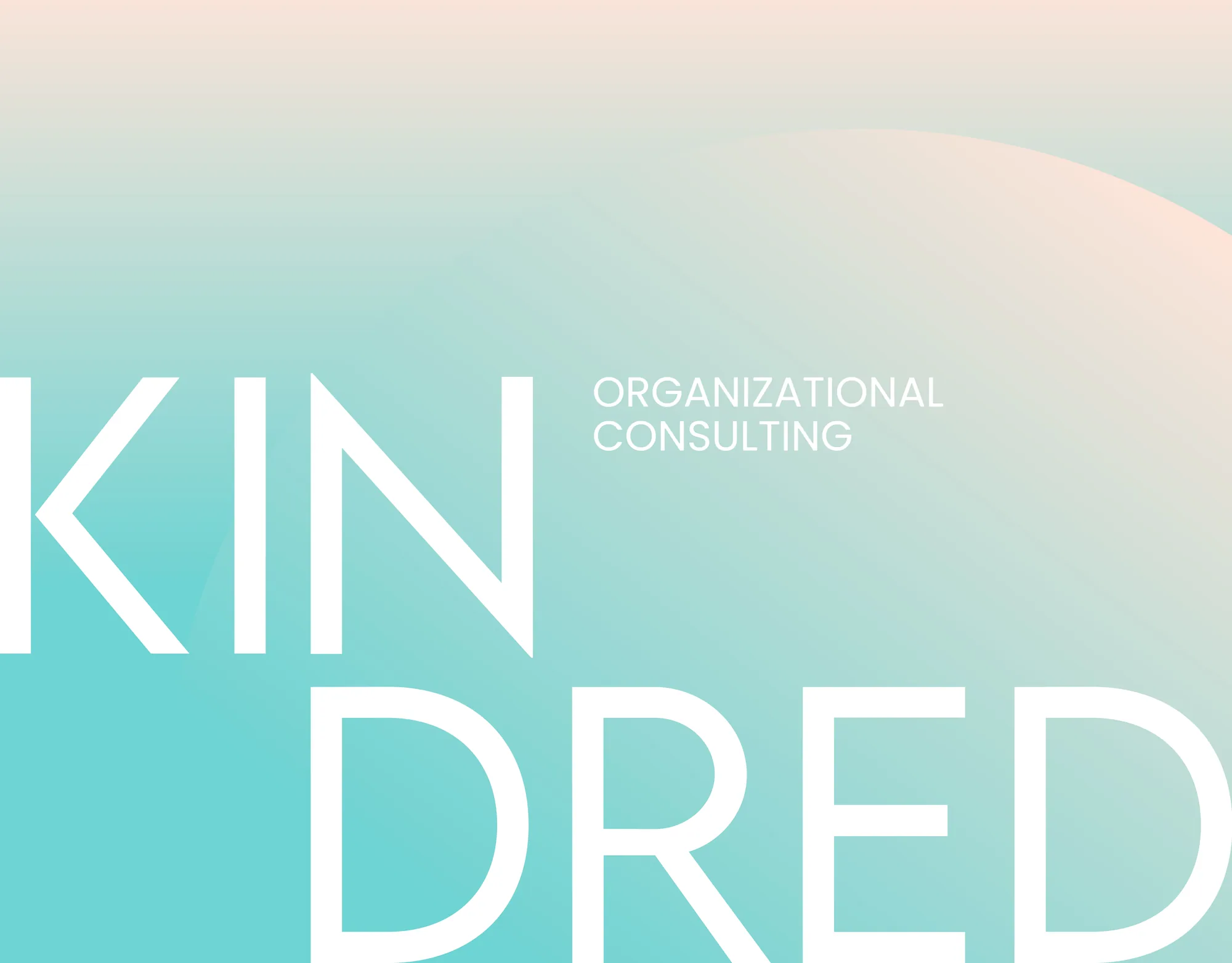
The mark they walked in with
The original logo set a thin, pale teal ring around a K, beside a wordmark in brown. Nothing about it was broken, and that was exactly the difficulty. It carried the warmth and the human side of what Kindred stands for, and people knew it, so we made a clear decision early on: we would not throw it away.
Keep the essence, rebuild the rest
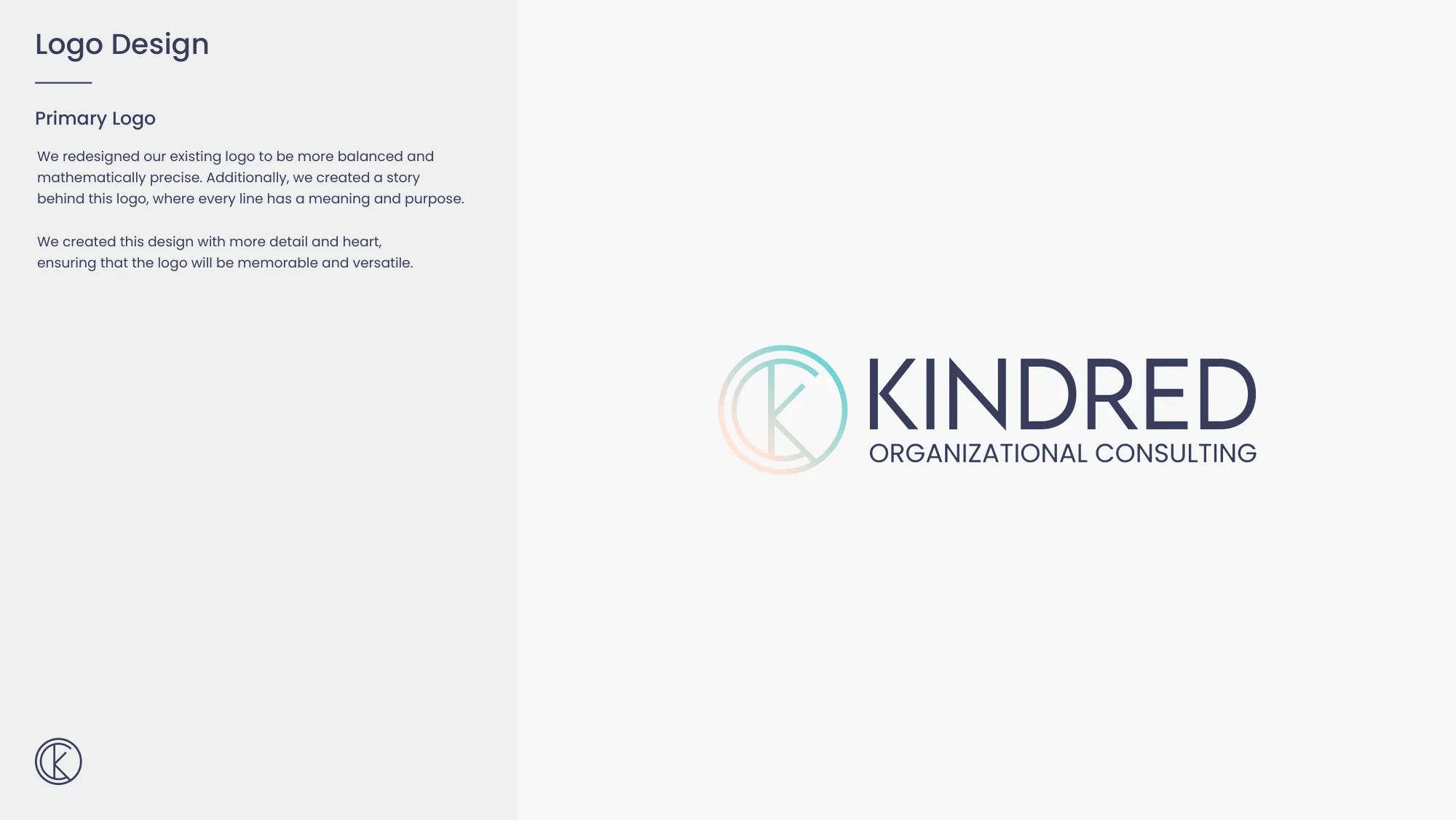
A full rebrand would have cost Kindred the recognition it had spent years building, and keeping the logo exactly as it was would have gone on holding the firm back. The answer sat in between. We kept the essence of the original mark and rebuilt everything around it with a professional hand: cleaner structure, better balance and sharper detail. As the brand guidelines put it, the redesigned logo is more balanced and mathematically precise, with a story behind it in which every line has a meaning and a purpose.
Every line on a grid
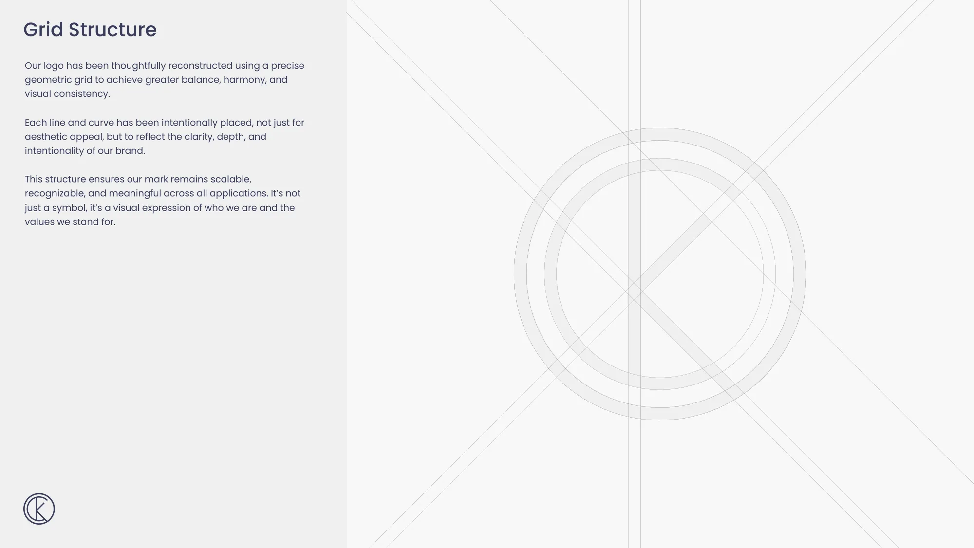
The mark was reconstructed on a precise geometric grid of circles and diagonal lines, which gives it balance, harmony and consistency by construction. That structure is what keeps the monogram recognisable at every size: the guidelines show the full logo at 100, 75, 45 and 25 per cent. For formats where the full lockup will not fit, a secondary logo carries the same structure in a simpler form.
Rules that stop it drifting
A logo without rules drifts the moment someone else starts using it, so this one comes with them. The full colour version is the default, with reversed and monochrome versions kept for the backgrounds and technical constraints that call for them. Clear space keeps other elements from crowding it, a co-branding lockup handles partnerships, and a short list of incorrect uses rules out stretching, recolouring, extra space between the mark and the wordmark, and effects or shadows.
Colours chosen for how they feel
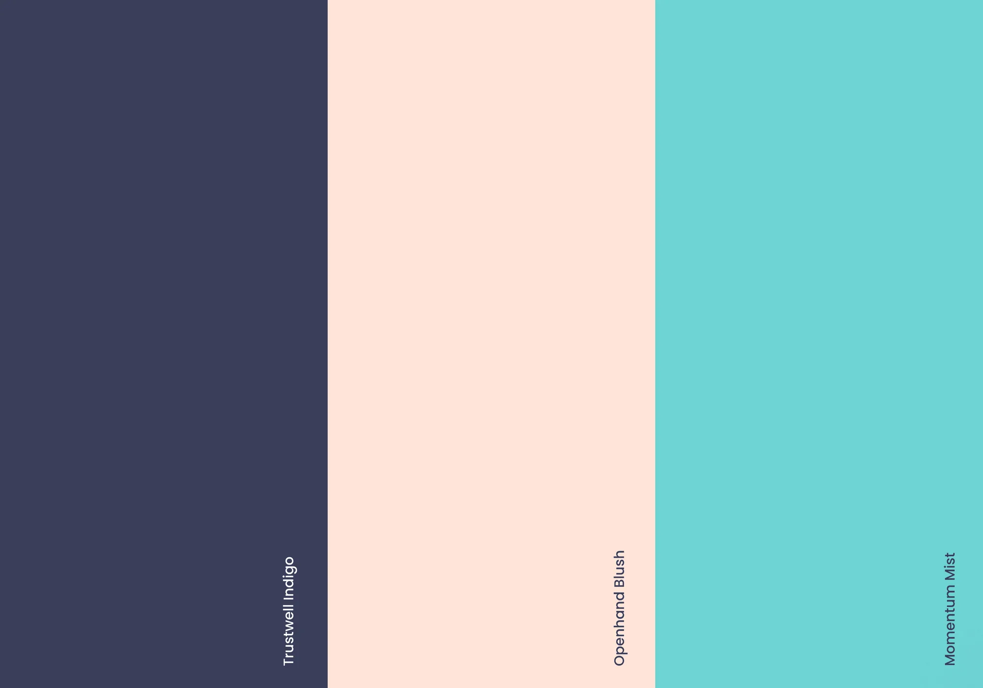
The palette was chosen for how it feels as much as how it looks. Trustwell Indigo, #3A3E5B, grounds the brand in credibility and maturity: steady leadership and the quiet strength that holds space for others. Openhand Blush, #FFE4D9, brings warmth and approachability, and a reminder of the empathy that honest conversations need. Momentum Mist, #6ED3D3, adds clarity and energy for forward movement, growth and purpose. Blend mist into blush and you get the gradient that now runs through the monogram itself.
A confident voice and a friendly one
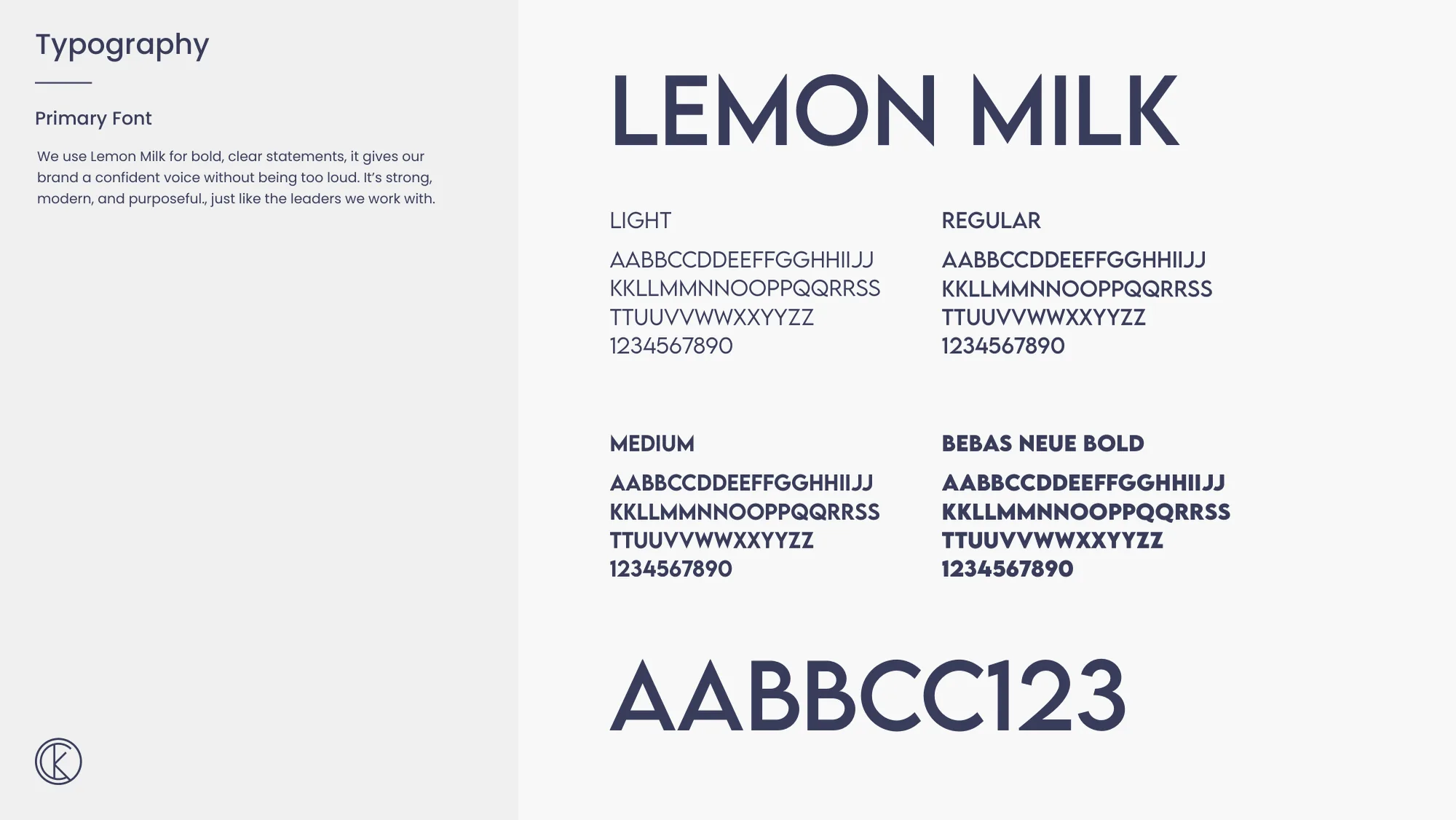
Two typefaces carry the voice. Lemon Milk is for bold, clear statements, confident without being loud: strong, modern and purposeful, like the leaders Kindred works with. Poppins is for everything else. It is clean, friendly and easy to read, which suits the thoughtful conversations the firm has with its clients. The hierarchy is fixed as well, with main headings in Lemon Milk and every level below them in Poppins, each at a set size and weight.
A toolkit for everything around the logo
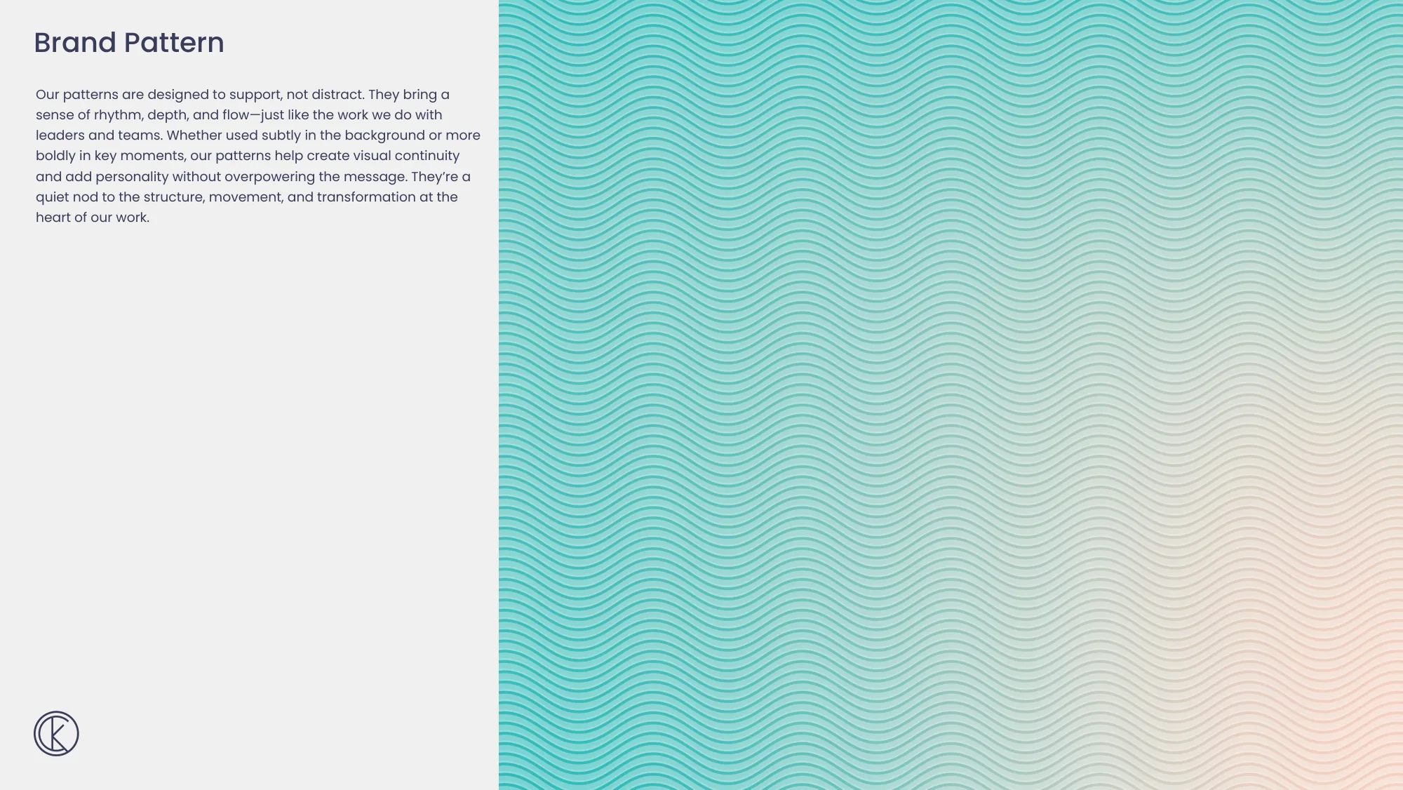
Most of what a client sees is the space around a logo, so the guidelines give that space its own tools. A brand pattern of flowing lines adds rhythm and depth without distracting from the message. Supergraphics, which the guidelines call the brand's most expressive asset, work as backgrounds or as overlays on photography. The photography itself is directed to show people and the joy in the work, and the icons share one line weight, rounded edges and balanced proportions, so they support the content without overpowering it.
On the team
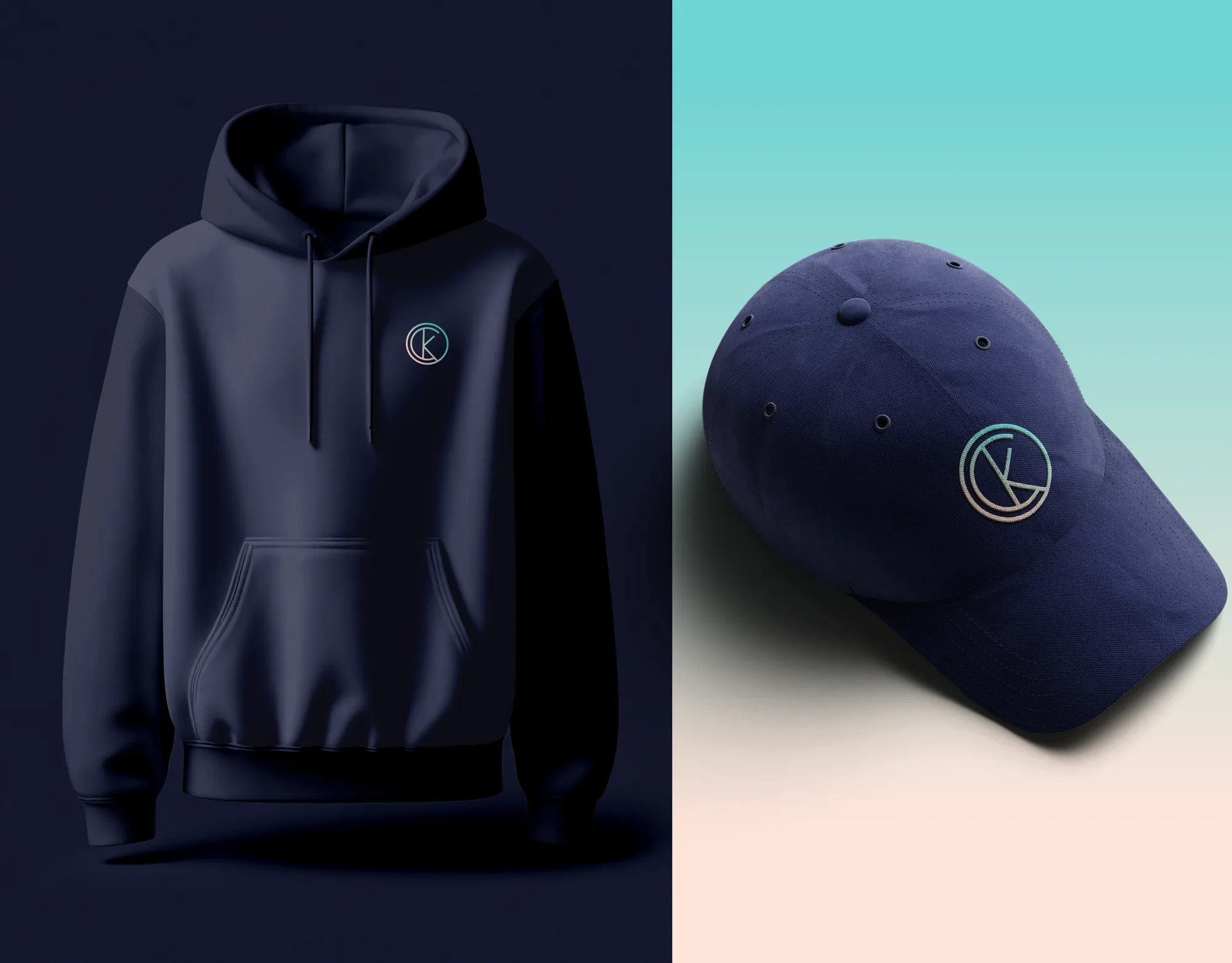
Uniforms are part of the system too: a navy hoodie and a navy cap carrying the monogram in the brand gradient, and a navy polo with mist trims. Apparel is a hard test for any mark, because thread punishes fussy detail, and the rebuilt monogram holds its shape at chest size.
On paper
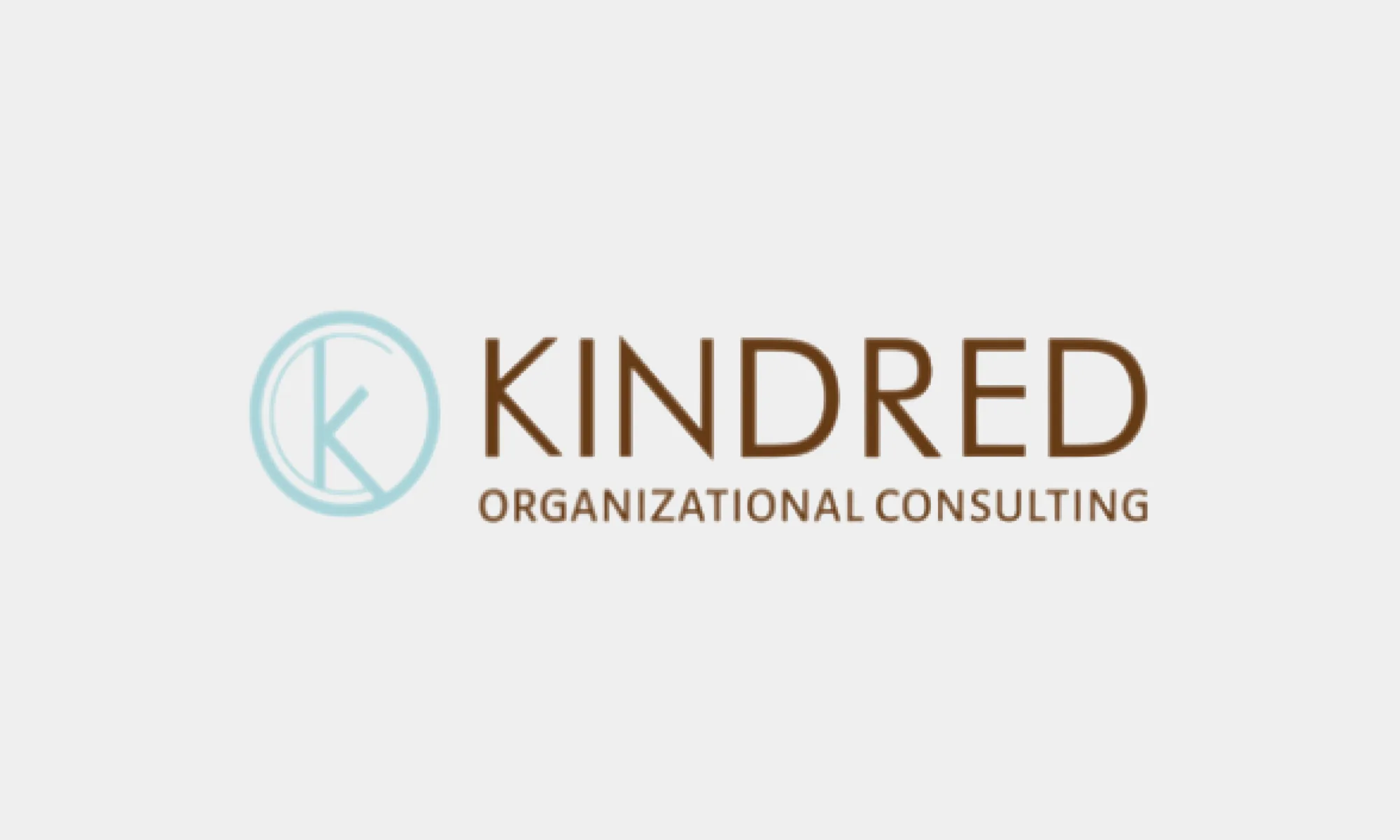
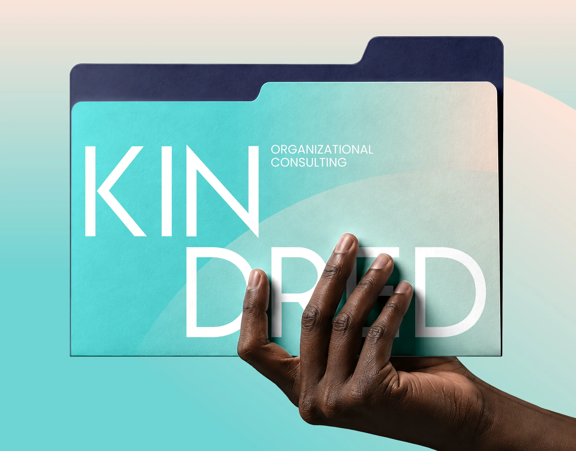
The collateral set covers a business card, a letterhead and an email signature, each built from the same typography and spacing, so a quick reply carries the same identity as a formal letter. The folder shows the system at its boldest, with the wordmark broken over two lines and set large enough to become the design.
On every screen
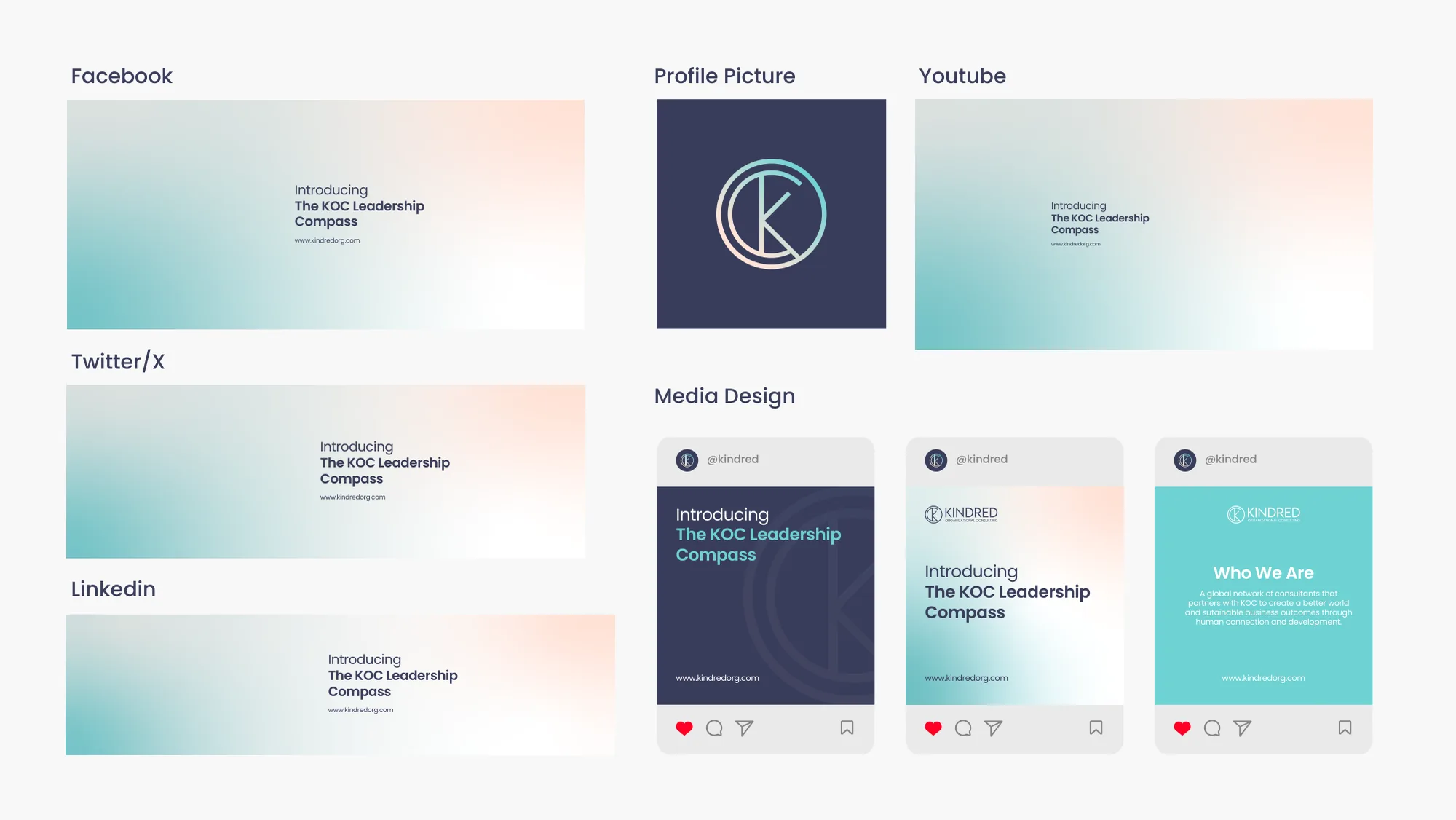
The social media kit gives each channel the same look: cover images for Facebook, X, LinkedIn and YouTube, a profile picture built from the monogram on indigo, and post designs in indigo, gradient and mist, including a series introducing the KOC Leadership Compass.
At full size
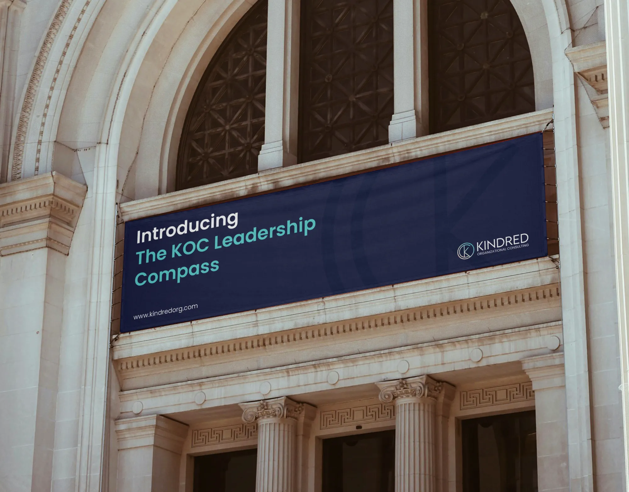
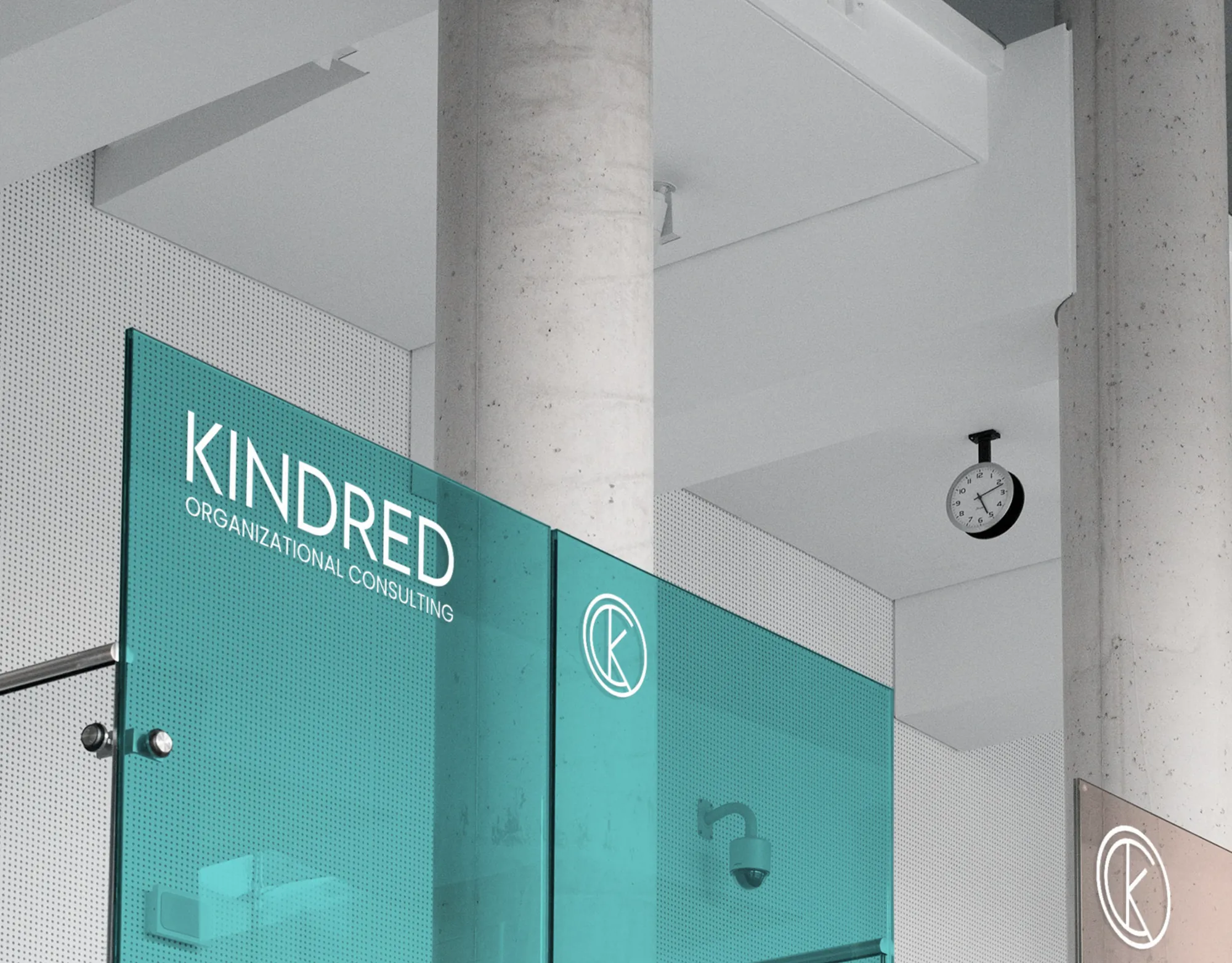
The case study also takes the identity to architectural scale, shown in mockups: a navy banner introducing the KOC Leadership Compass across the arched front of a stone building, and the wordmark and monogram in white on teal glass inside an office.
The whole identity in one frame
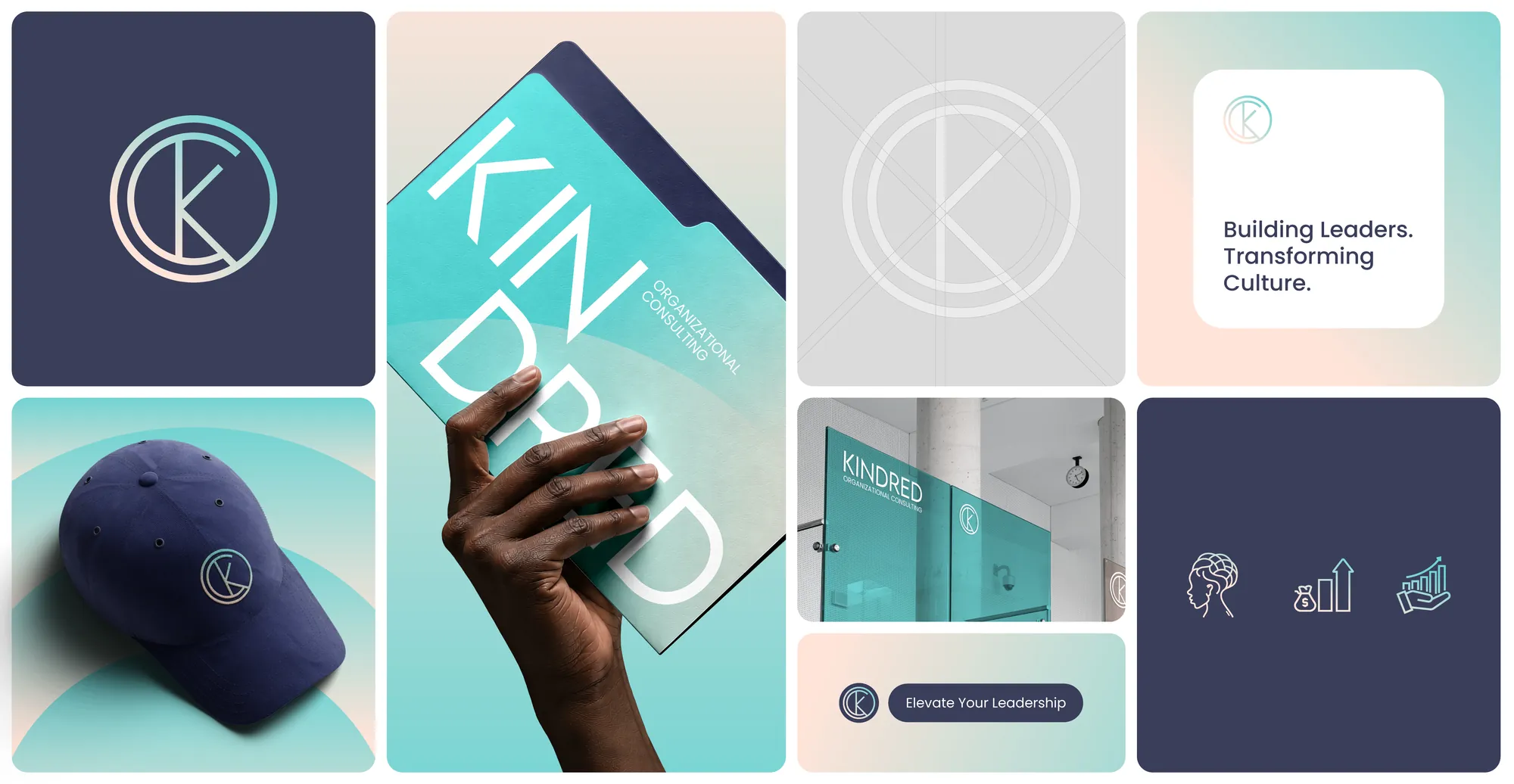
Put side by side, the pieces read as one brand: the monogram on indigo, its construction grid, the folder, the cap, the glass, a post and a set of icons, all in the same three colours and the same two typefaces.
What changed
Kindred kept its mark and the recognition that came with it. Everything around the mark changed: a monogram rebuilt on a grid, a logo with rules, three colours with a reason each, two typefaces with separate jobs, and a toolkit that runs from uniforms to social media, all written down in brand guidelines the team can follow without calling a designer. The aim was a brand that existing clients still recognise instantly and new clients take seriously from the first look. If your own logo is holding good work back, the free brand diagnostic on this site is a quick way to find out.