Power that whispers: the BlackOrchid identity
BlackOrchid protects the digital lives of people who already have attention. The brief was power without volume, so the orchid is drawn as a circuit and the type does the talking.
5 October 2026 · 4 min read
BlackOrchid is a private intelligence boutique from Corvo Security. It protects the digital lives of high-net-worth individuals, family offices and executives, and its Revenue Engine builds the automation systems that grow their businesses. Its clients already have attention. What they need is control. The brief was a brand that feels powerful without raising its voice, which gave us the line the whole identity hangs on: power that whispers.
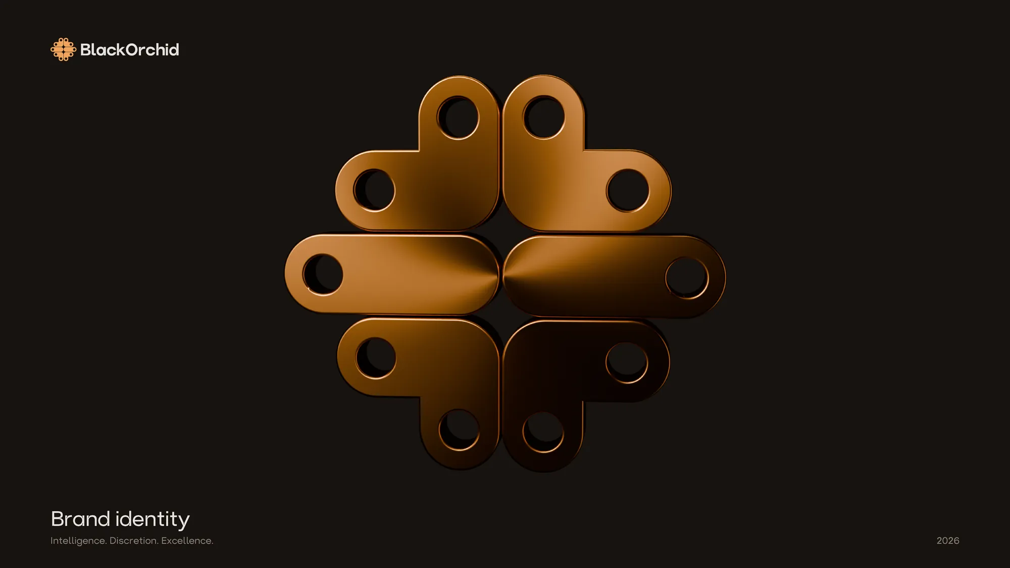
An orchid built like a circuit
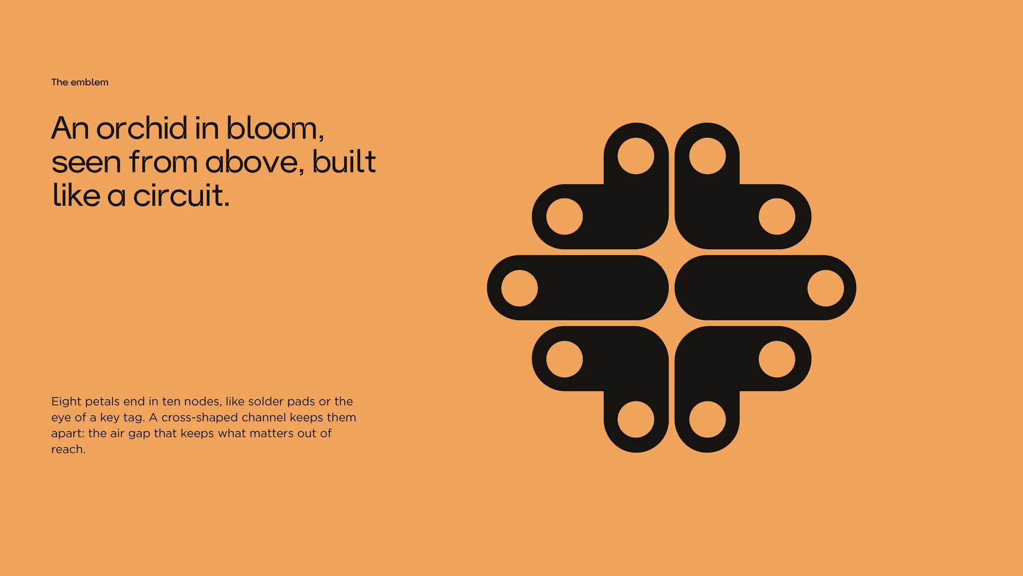
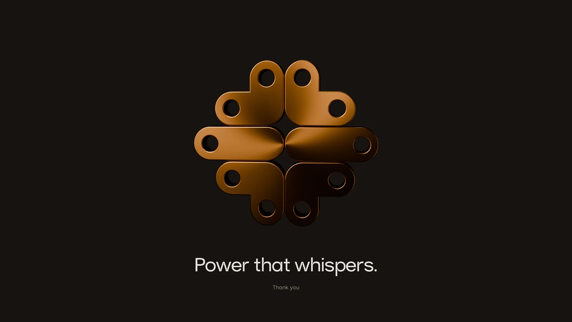
The emblem is an orchid in bloom seen from above, drawn like a circuit. Eight petals end in ten nodes, which read as solder pads or as the eye of a key tag depending on where you meet them. A cross-shaped channel holds the petals apart, and that gap is the whole idea: it is the air gap, the deliberate break that keeps what matters out of reach. The mark is built from one repeated unit, which is what lets it survive the trip from a favicon to a wall sign.
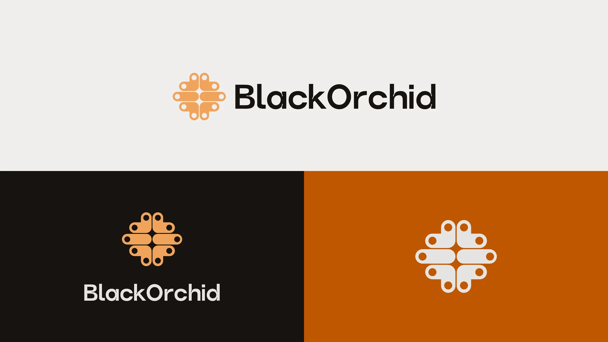
One mark, three grounds
A security brand is seen in low light, on a phone, on a sign and at the top of a letter, so the lockup has to hold in each. The primary version sets the emblem beside the wordmark on platinum. The reversed version moves it onto Orchid Black, where the ember emblem does the work. The emblem on its own, in platinum on Longhorn, covers the places where a full lockup would crowd.
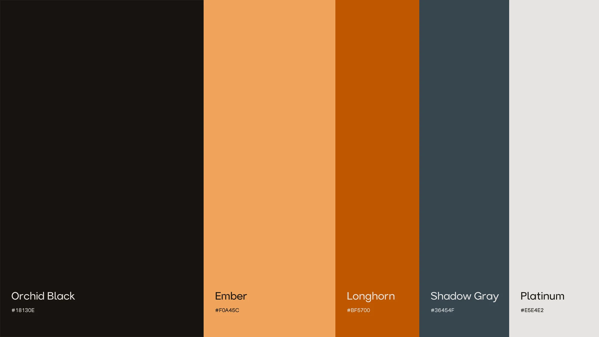
Colour with a single warm signal
Orchid Black, #18130E, carries the brand, and the palette runs about 85 per cent dark to 15 per cent light. Ember, #F0A45C, is the one warm colour, used once in a layout and where it counts: a single word, a single button, the emblem on a dark card. Longhorn, #BF5700, is its deeper relative for grounds and detail. Shadow Gray, #36454F, and Platinum, #E5E4E2, do the quiet work. The restraint is the strategy, because a brand that whispers cannot afford more than one raised voice.
Type set as the image
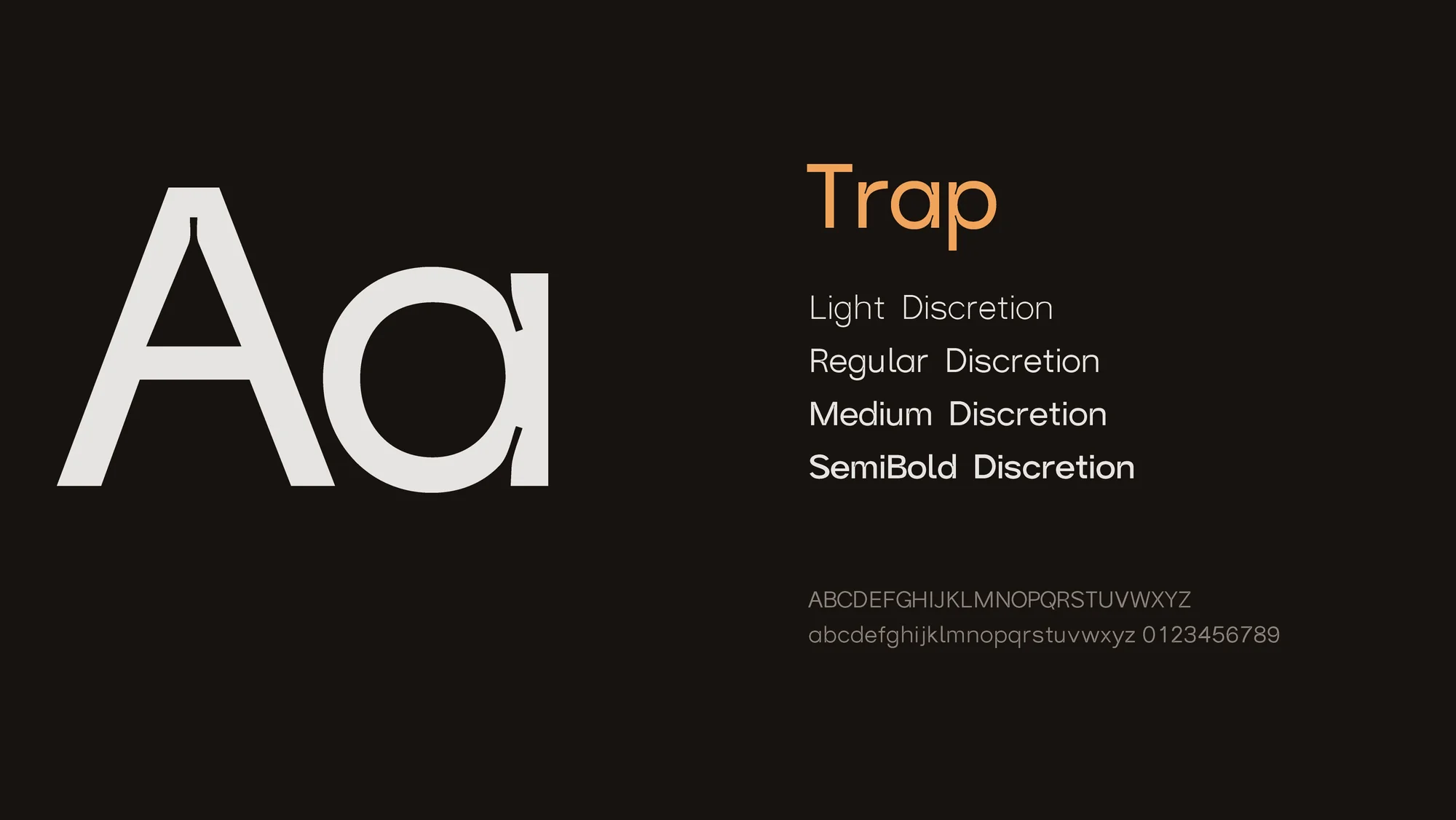
Trap is the primary typeface, set large and tight so the words themselves become the picture. Gotham handles the running text. Nothing else is invited in: no decoration, no circuit-board shorthand, no padlocks. The system is led by typography and deliberately quiet, which leaves space as the main material.
Lines that sound like the brand
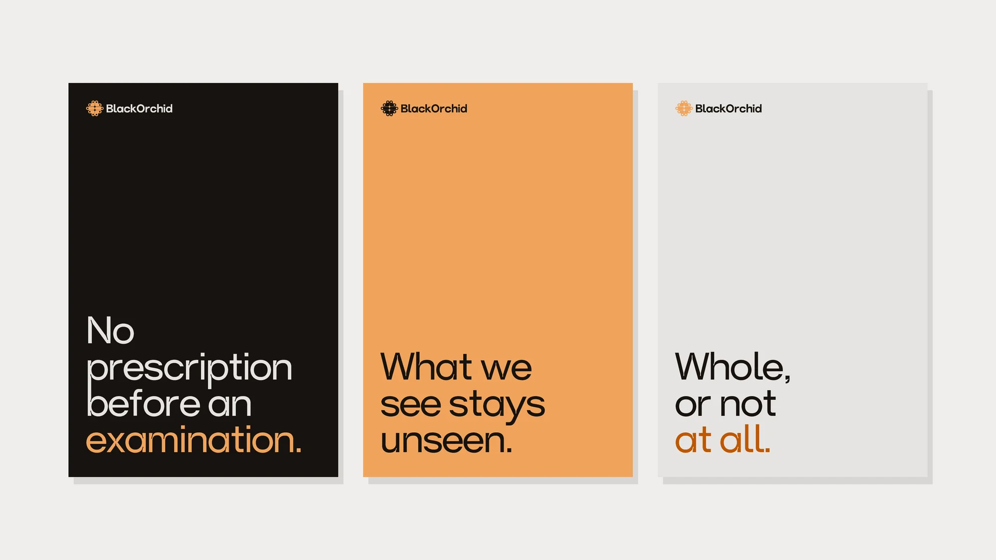
Three statements fix the tone of voice: no prescription before an examination, what we see stays unseen, and whole, or not at all. They are the firm's manners written down. Each is a promise a security practice can be held to, and each is short enough to survive being set on a poster, a card or the back of a letter.
On paper
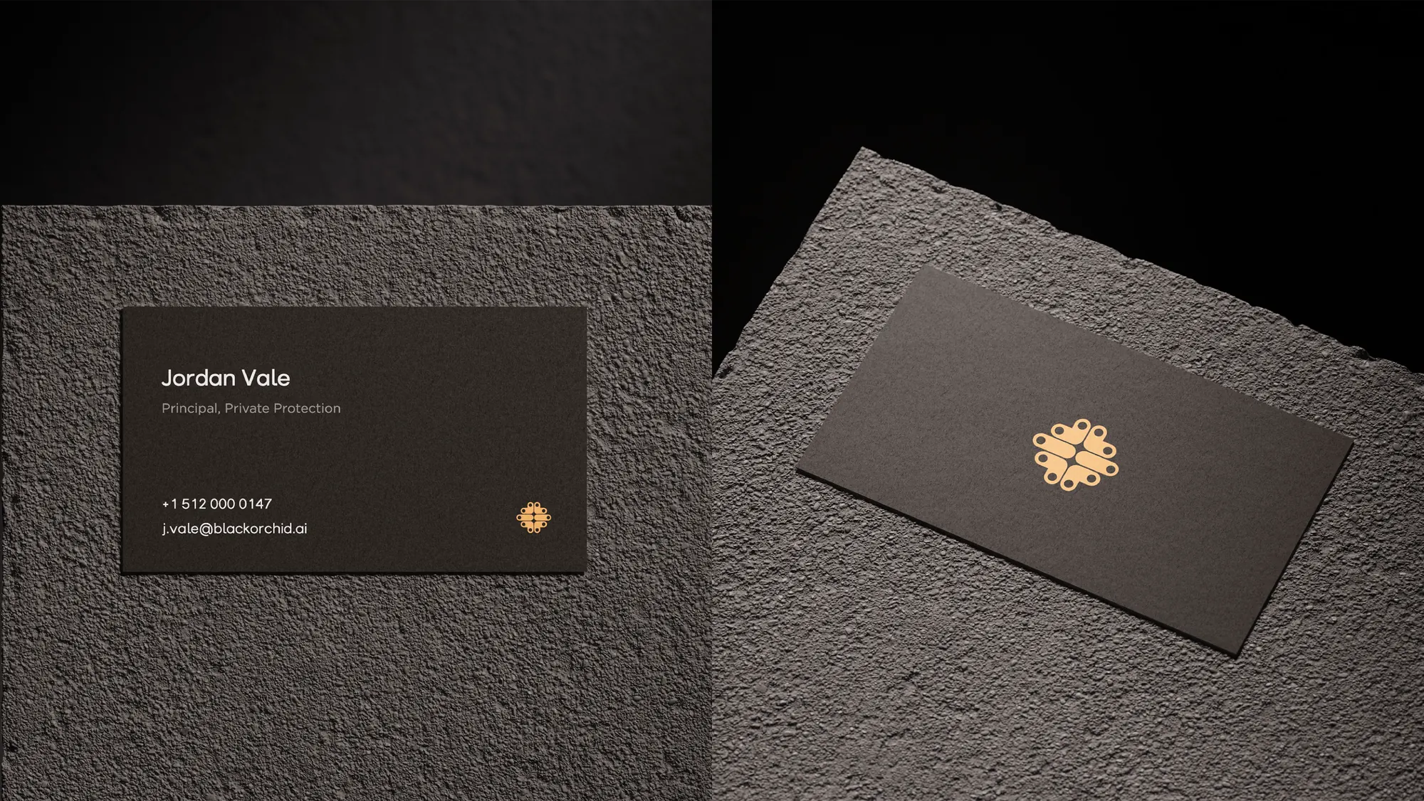
The business card is almost nothing: a name, a role, a phone number and an address in platinum on Orchid Black, with the emblem in ember in the corner. Turn it over and the card is only the emblem. For a firm that sells discretion, how little the card says is the message.
The whole set
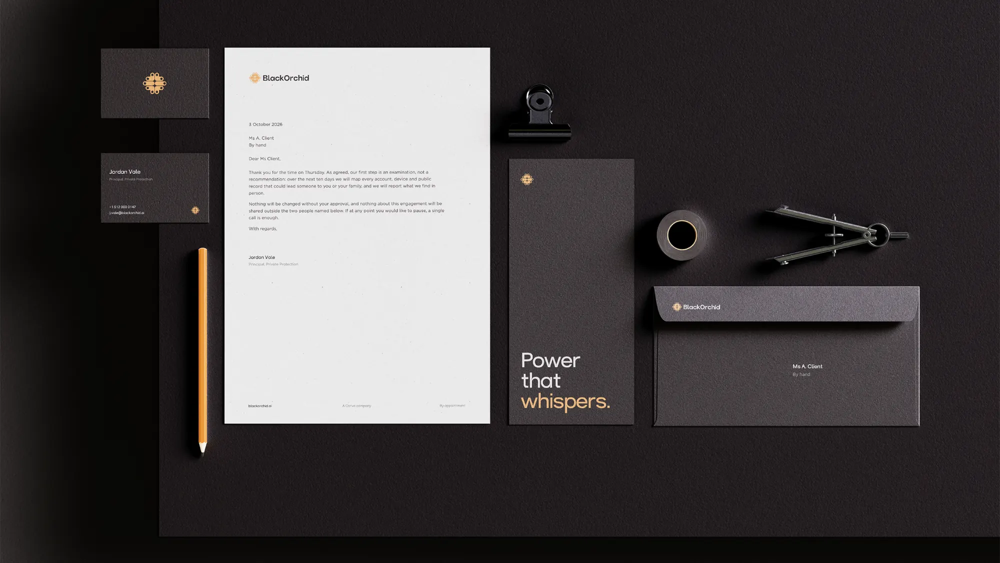
Letterhead, envelopes and cards share one layout, so a letter looks like the card it arrives with. The letter keeps the brand's manners too: it sets out the first step, the examination, before anything at all is recommended.
At the door
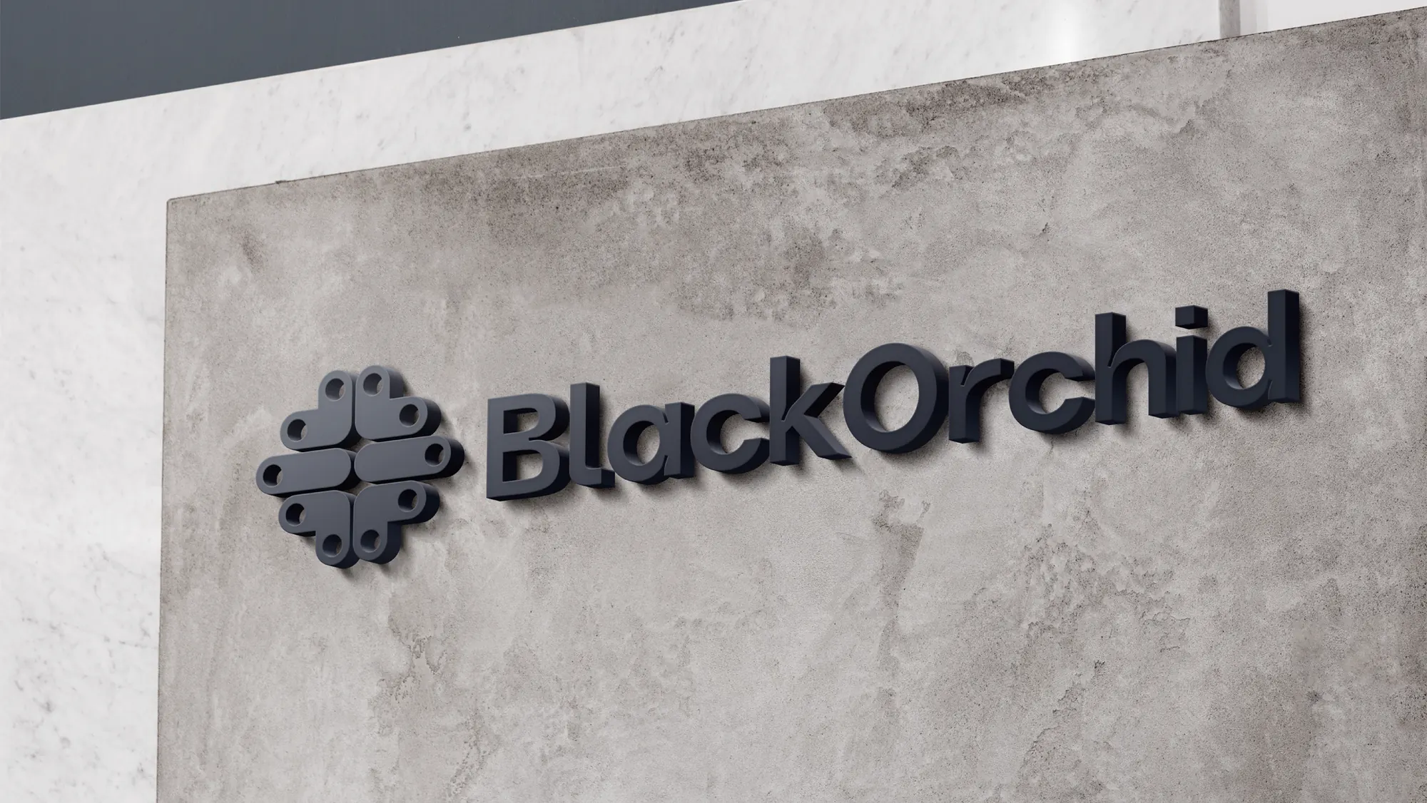
On a concrete wall the emblem gives up its colour and becomes a shape. That is the real test of a mark built from one repeated unit: at sign scale, in a single tone, with daylight across it, it still reads as the same object.
In the product
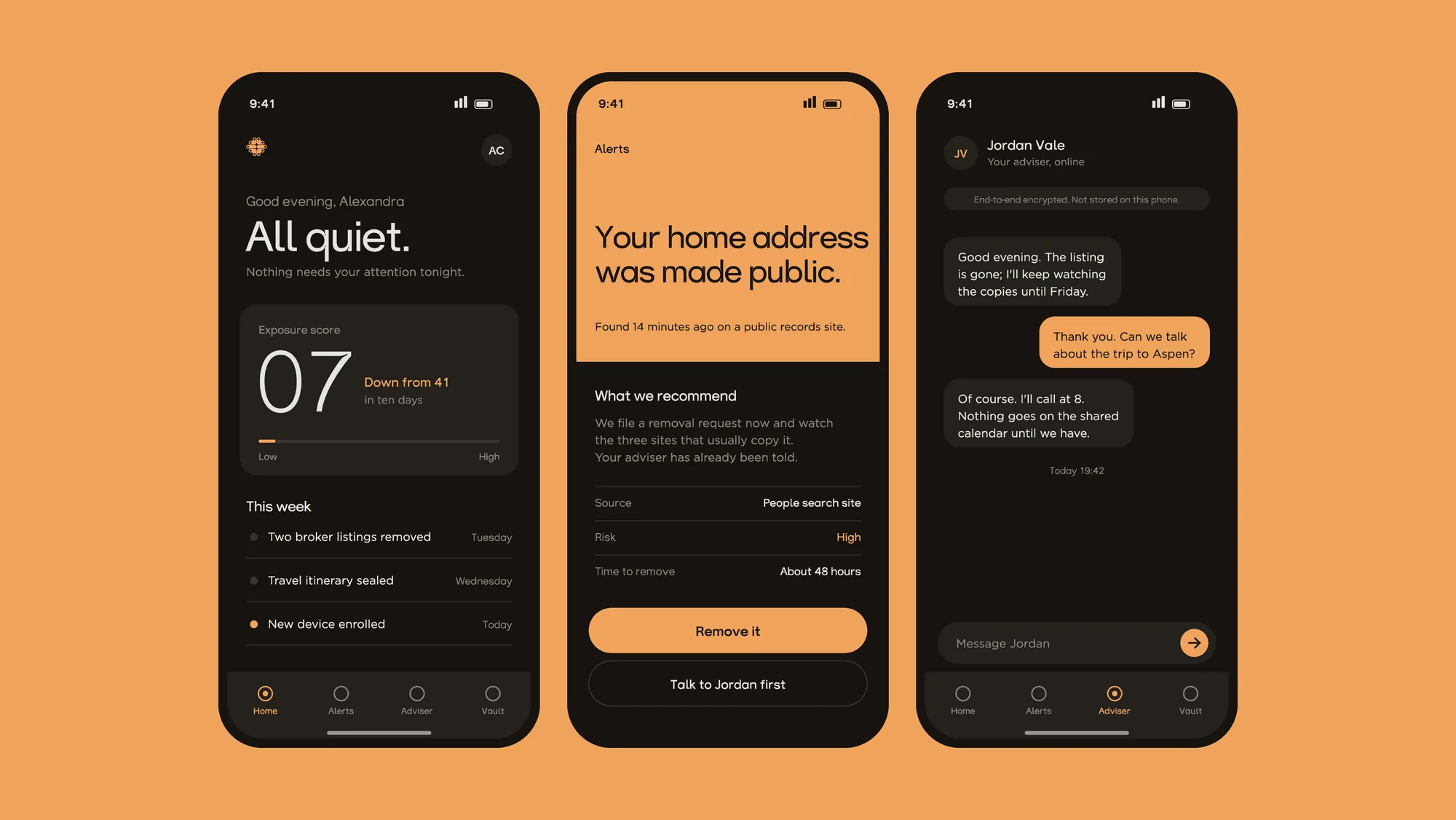
The identity had to work as an interface as well. The app opens on an exposure score and the line All quiet. Alerts arrive in ember when a home address turns up on a public records site, and the adviser sits in a chat thread rather than a ticket queue. Ember appears exactly where something needs doing, which is the colour rule earning its keep in a live product.
On the web
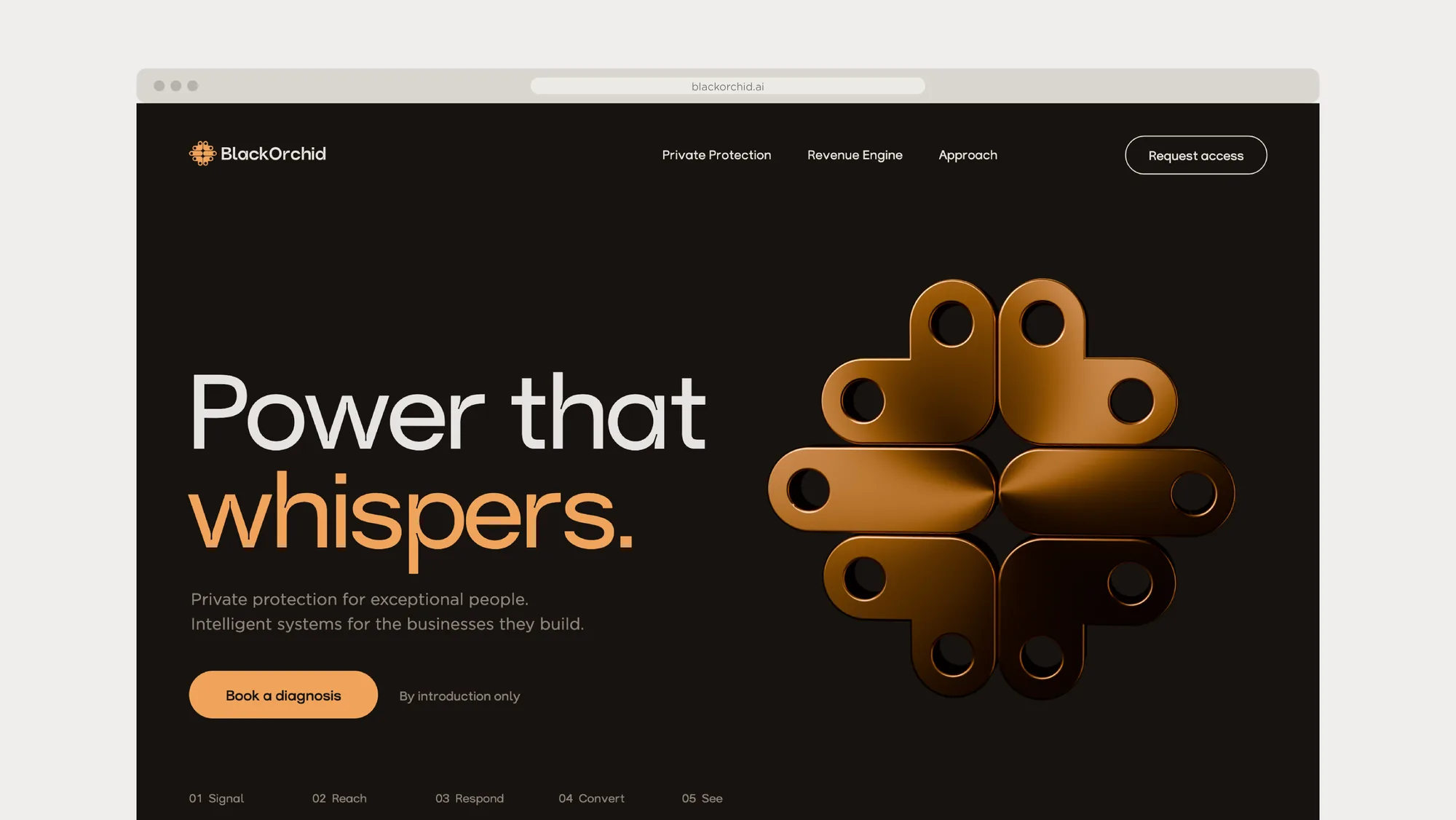
The website leads with the line, with the bronze emblem turning beside it, and the invitation is to request access by introduction only. The navigation names the two halves of the business plainly: private protection, and the Revenue Engine.
On the team
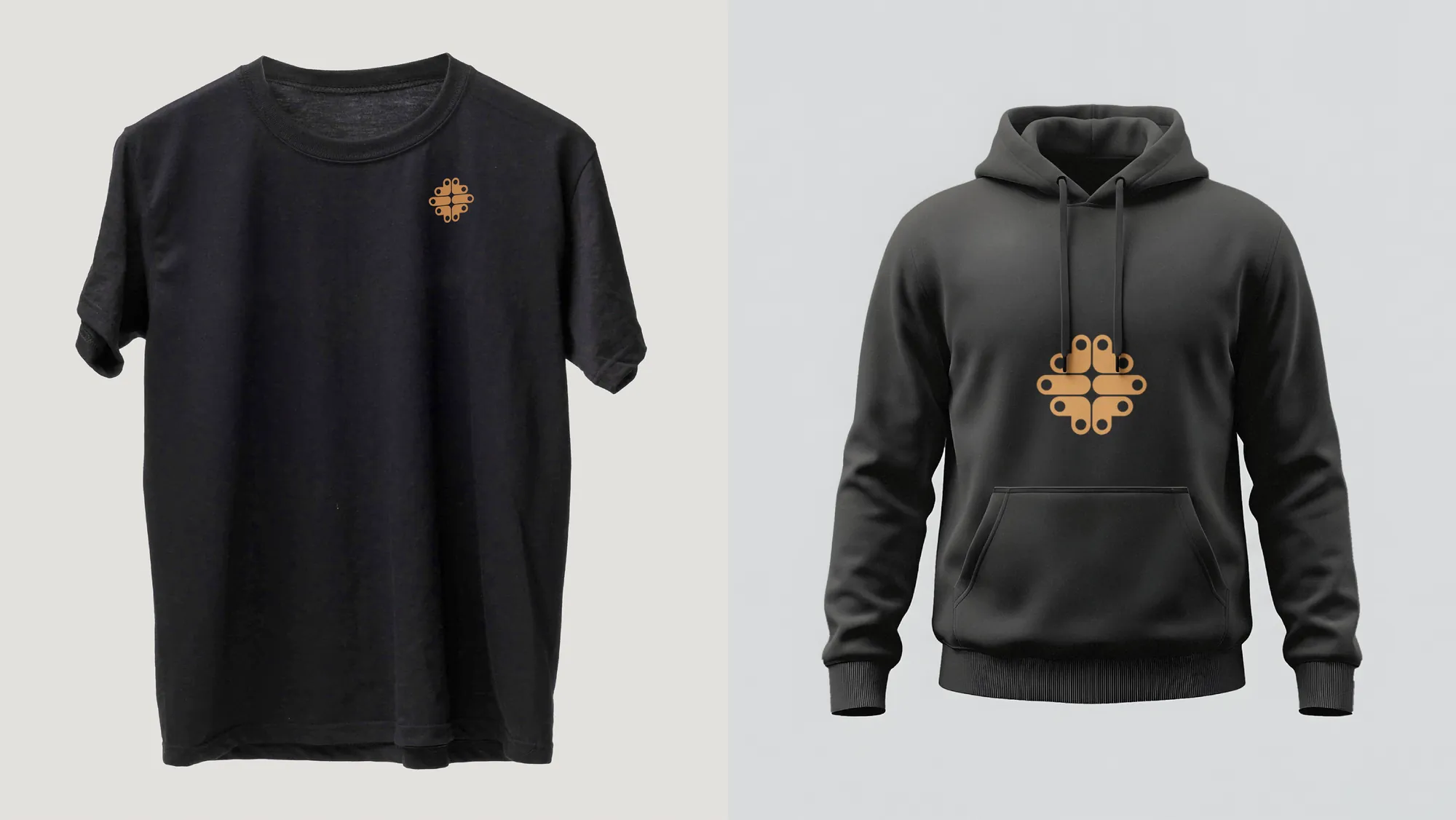
Apparel is the test a fussy mark fails. Because the emblem is built from one unit at a single weight, it holds at chest size in one colour, on a tee, a hoodie, a cap or a beanie.
What we delivered
Brand strategy, the logo, the visual identity and a brand guidelines book. The typography system, the colour palette and iconography. Stationery, app screens, the website, apparel and social design, and motion on top. The emblem was rendered in Blender, the mockups built in Photoshop, the identity drawn in Illustrator, and the reels cut in After Effects to a score written for them. If you are weighing up an identity of your own, the free brand diagnostic on this site is a short way in.