All work
Leadership consulting
Kindred
A mark people already recognised, redrawn and given a system to live in.
The brief
Leadership consulting
Brand identity, Logo redesign, Brand guidelines
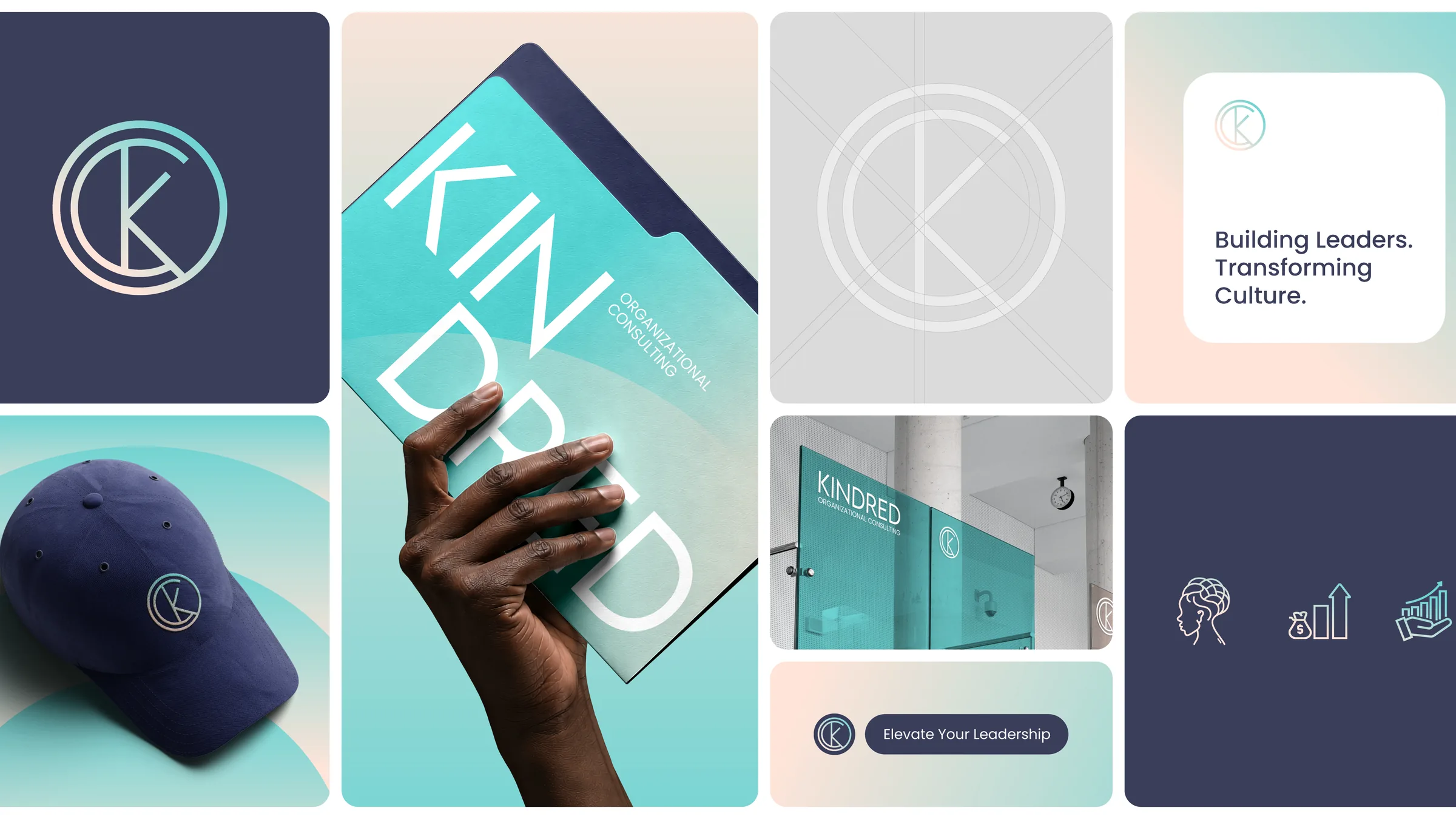
Kindred Organizational Consulting had spent years helping organisations grow healthier from the inside, and had the recognition to show for it. Its logo no longer matched the work. A full rebrand would have cost that recognition, and leaving the mark alone would have kept holding the firm back, so we kept the essence of the original and rebuilt everything around it.
What we delivered
- The monogram redrawn on a precise geometric grid
- Primary and secondary logos, with colour variations
- Clear space, minimum sizes and co-branding rules
- Three named colours, each with a reason
- Typography: Lemon Milk for statements, Poppins for the rest
- Brand pattern, supergraphics and iconography
- Business card, letterhead and email signature
- Uniforms, signage and a social media kit
- Brand and visual guidelines book
Outcome
Not published. The numbers that would go here belong to the client rather than to us, so this page states only what was delivered.
The pieces
-
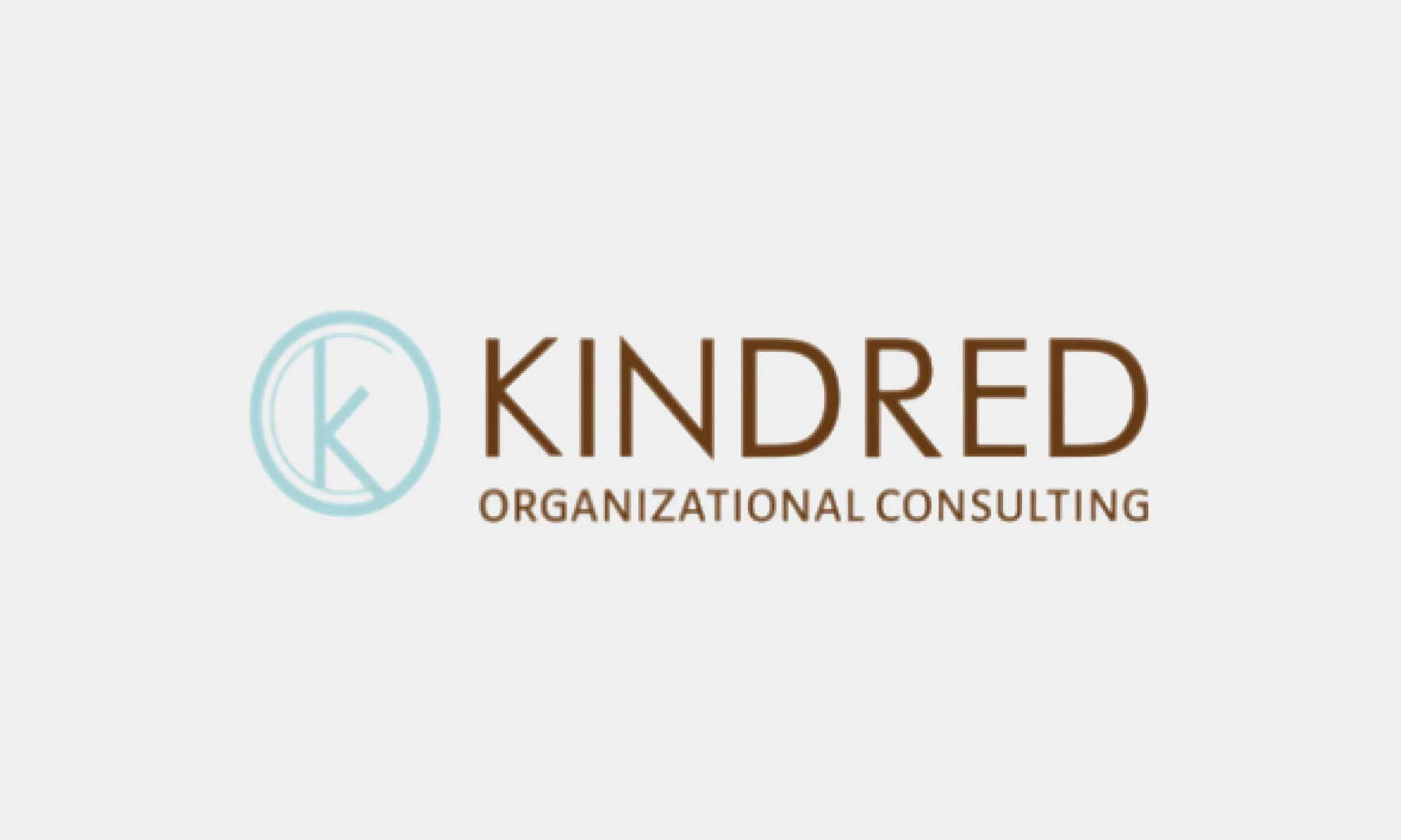
Kindred's original logo: a thin pale teal ring enclosing a K, beside a brown wordmark
-
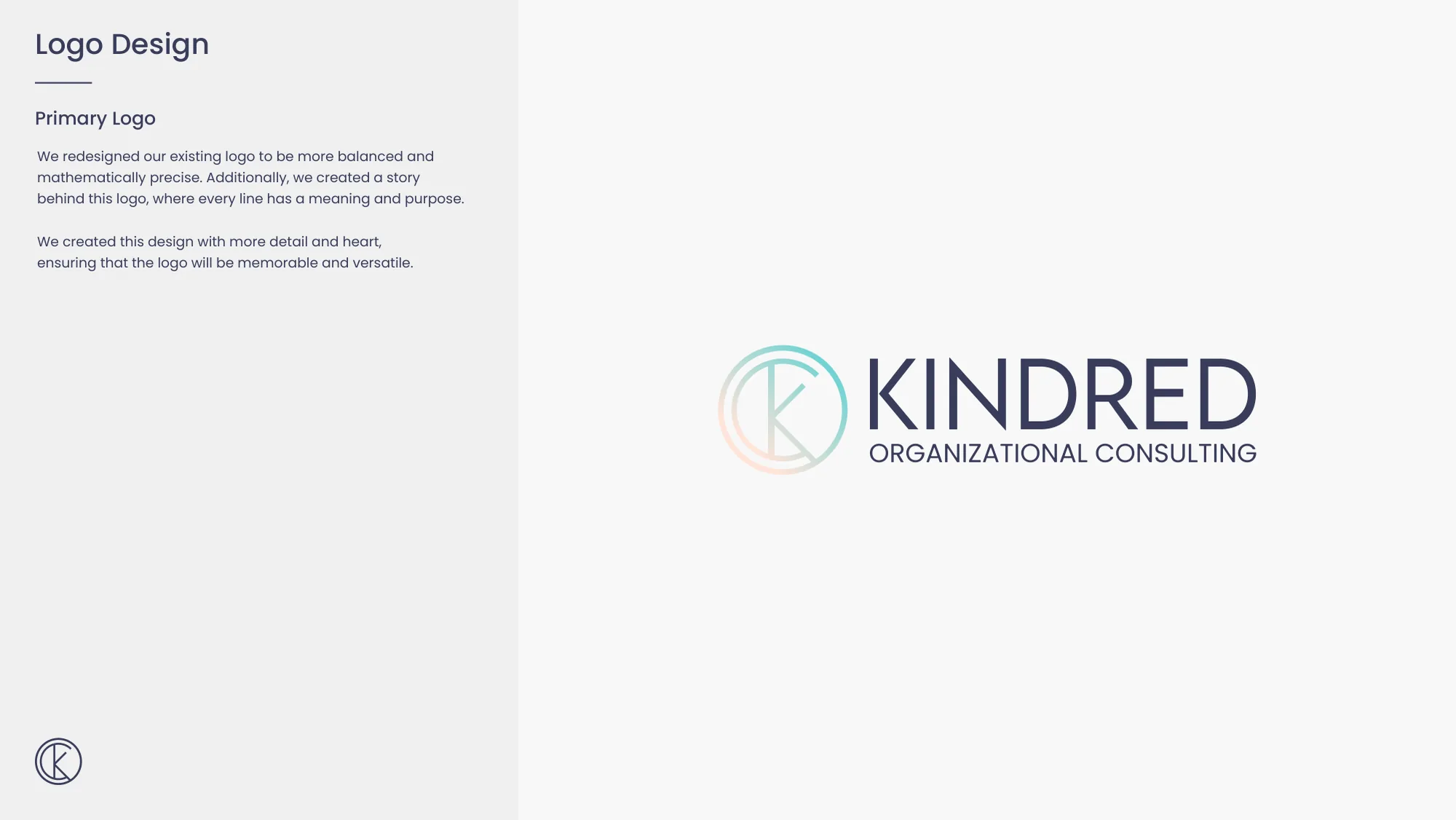
The redesigned Kindred primary logo: the monogram in a mist to blush gradient beside the wordmark in indigo
-
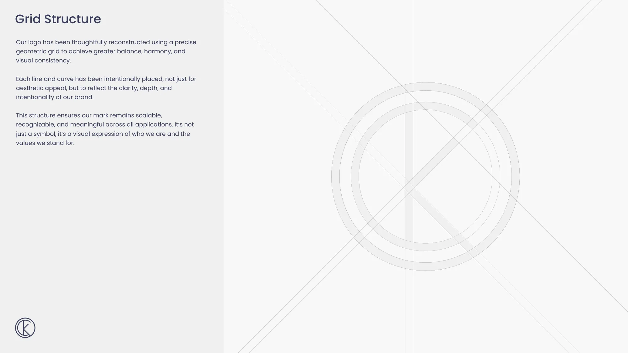
The Kindred monogram drawn over concentric circles and diagonal construction lines
-
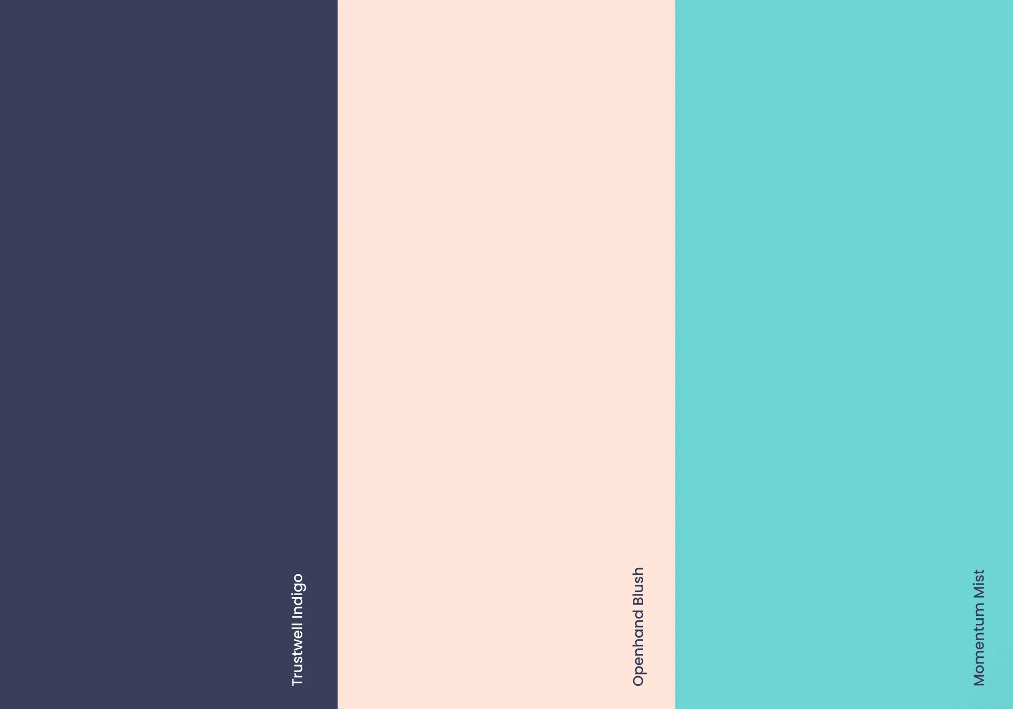
Three colour stripes labelled Trustwell Indigo, Openhand Blush and Momentum Mist
-
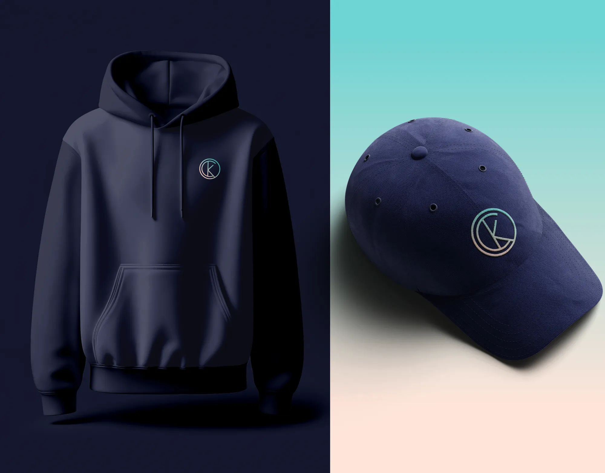
A navy hoodie and a navy cap carrying the Kindred monogram in the brand gradient
-
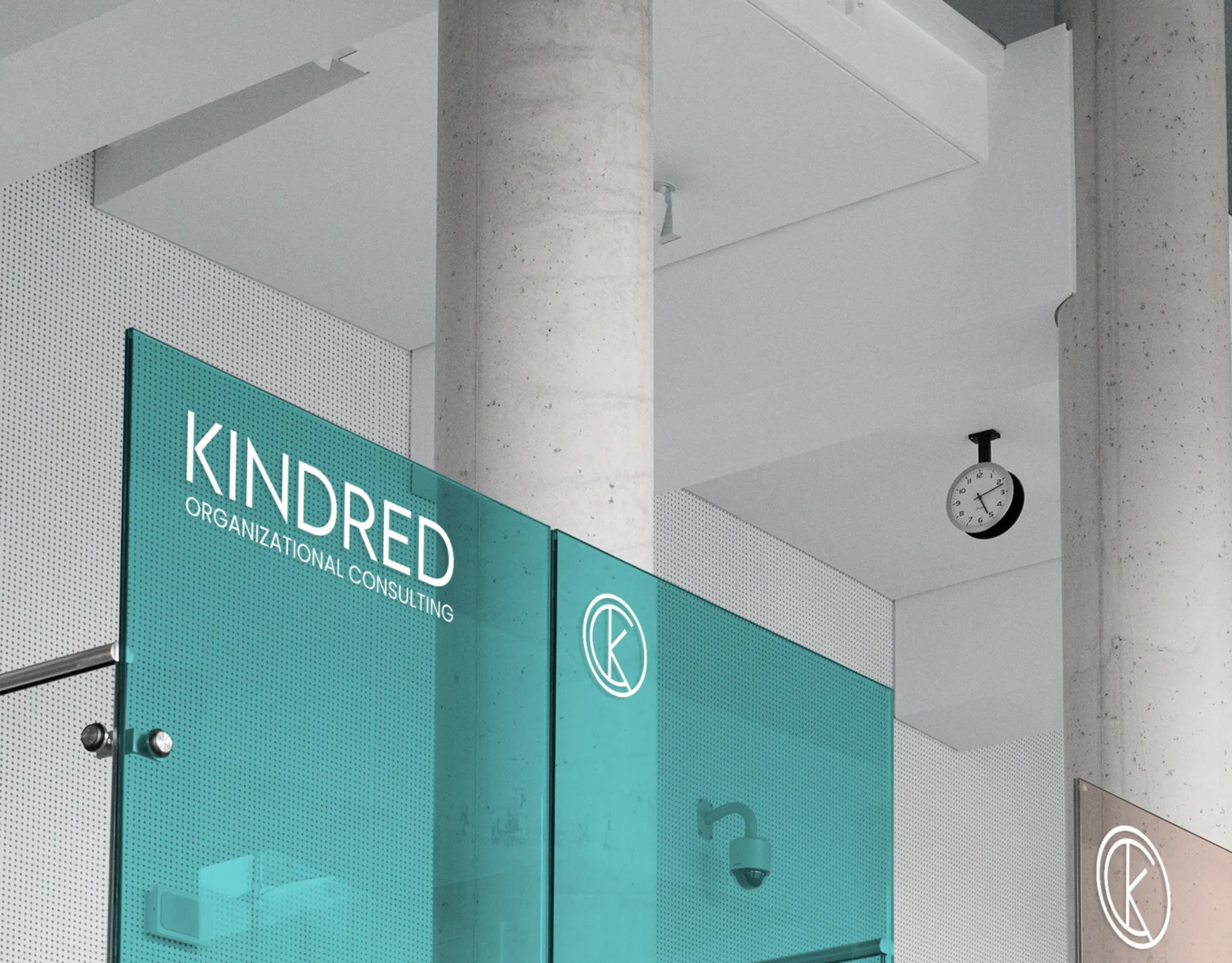
The Kindred wordmark and monogram in white on a teal glass partition in an office