NOWA
02 Introduction
She walks in covered head to toe and the room still turns.
NOWA makes abayas for young women who never once saw modesty as a limit. They came to us with a name they loved and nothing to put it on. No logo, no colours, no rules. We built them a brand that feels expensive before anyone gets close enough to read a price tag.
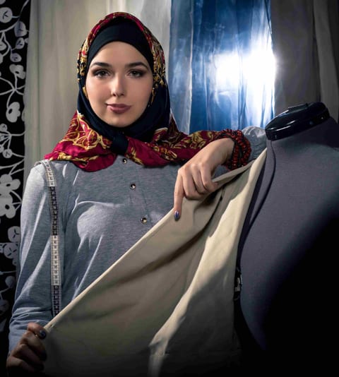
You can dress quiet and still take up the whole room.
That one line decided the gold, the spacing, and everything we left out.
04 The mark
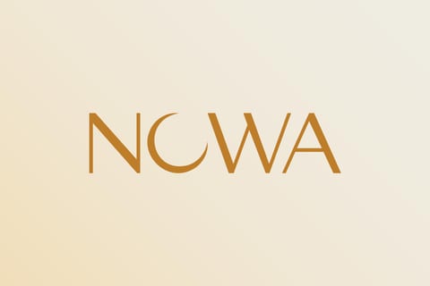
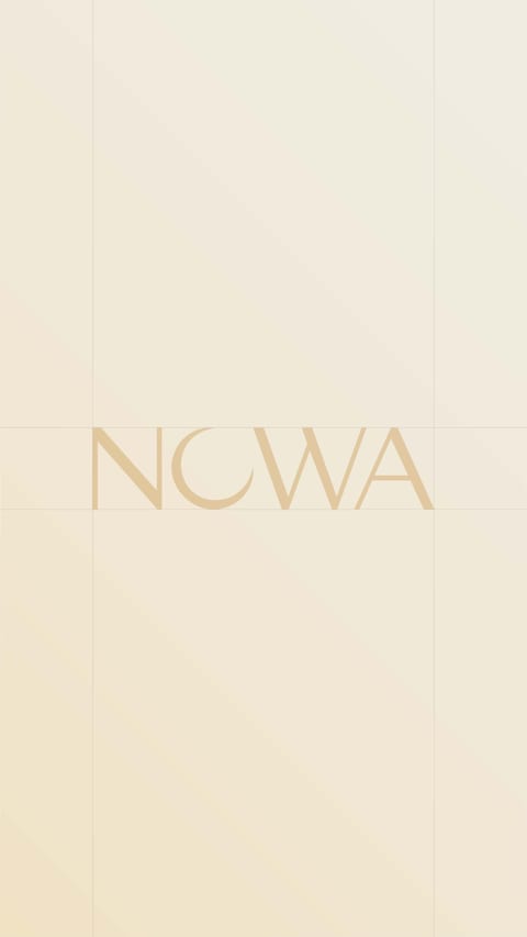
We swapped the O for a moon and left the rest alone.

05 Construction
Small change. Took forever.
The moon sits exactly where the O used to. Same width, same weight, same rhythm. You read the word first and catch the moon a second later. That order is the whole trick.
That curve ate most of the project. Too thick and it stopped being a letter. Too thin and it disappeared the moment we shrank it. We kept redrawing until one version survived both.
Gold foil, twelve millimetres, stitched into the neck of an abaya. If it holds up there it holds up anywhere.
06 Exploration
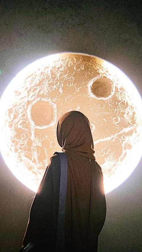
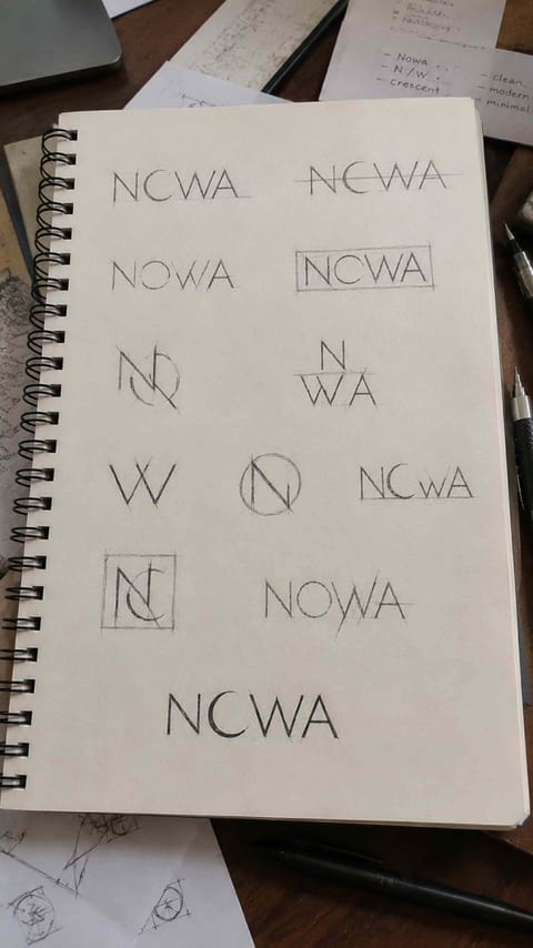
Everything else we tried felt borrowed. The moon didn't.
07 Typography
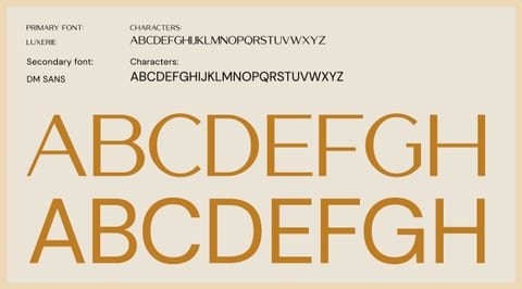
Luxerie for the moments that matter. DM Sans for the other ninety percent.
08 Colour
Gold, dialled back until it stopped looking like money and started looking like light.
A single artful frame — large colour blocks, texture, or material that carries the palette.
- Ratio
- 21:9
- Size
- 2800px+ wide
- Frame
- Abstract, immersive
MotionFades up from the ground and drifts on a parallax layer
09 Graphic language
Icons drawn with the same pen as the logo.
Brand graphics laid out as a set — pattern, iconography, or the supporting shapes.
- Ratio
- 3:2
- Size
- 2200px+ wide
- Frame
- Systematic, tiled
MotionScales in with a slight rotation, resolving to square
10 In the hand
Thick uncoated card, gold foil, nothing else. You feel it before you read it.
A large, tactile mockup — both sides, edge or stock detail if it earns its place.
- Ratio
- 16:9
- Size
- 2400px+ wide
- Frame
- Angled or flat-lay, real light
MotionSlides in from the left as it enters
11 Stationery
The boring stuff, treated like it matters.
Correspondence or document.
- Ratio
- 4:5
MotionCascades from centre
Envelope or comp slip.
- Ratio
- 4:5
MotionCascades from centre
Folder, notebook, or tag.
- Ratio
- 4:5
MotionCascades from centre
The most cinematic application shot, edge to edge — packaging, product, or the identity in a real environment. A full-bleed clip is at its best here.
- Ratio
- 21:9 (full width)
- Size
- 3200px+ wide
- Frame
- Room to breathe; safe centre
MotionSlow push-in (Ken Burns) across the whole section
13 Social
On a phone screen everything is shouting. This one just sits there.
Profile or key post.
- Ratio
- 9:19
MotionRises into stack
Story or carousel.
- Ratio
- 9:19
MotionLifted centre frame
Grid or reel cover.
- Ratio
- 9:19
MotionRises into stack
14 Website
A lot of white space and one gold mark holding it all down.
One tall, full-page capture of the site. It scrolls inside this pinned browser frame as you move down the page. A screen-recording video plays here instead.
- Ratio
- Tall (1440px wide)
- Size
- 1440 × up to ~6000px
- Frame
- Homepage, full length
MotionSection pins; the screenshot scrubs upward inside the frame
Tip: also supply a mobile screenshot (9:19) — drop it beside the frame if you want the responsive story too.
15 Environment
Blow it up to four metres and the moon still does all the work.
Large-format out-of-home — the brand at its biggest.
- Ratio
- 16:9
- Size
- 2400px+
MotionParallax, fastest layer
Signage, wayfinding, or a storefront application.
- Ratio
- 3:2
- Size
- 2200px+
MotionParallax, slower layer
Photography or film of the brand in real hands or spaces — warm, human, unstaged where possible.
- Ratio
- 16:9 (full width)
- Size
- 2800px+ wide
- Frame
- Cinematic, shallow depth
MotionLong, slow fade and settle — the calmest beat on the page
17 Gallery
Everything else we made.
Supply 6–10 images. Real images open in a lightbox on click.
New label. Doesn't look new.
Next project